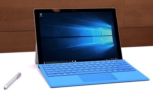
Remember when Apple’s Tim Cook referred to Microsoft’s Surface tablet as the equivalent of marrying a refrigerator with a toaster? My, how the times have changed: Apparently responding to the success of Microsoft’s Surface Pro line, Apple has debuted its own refrigerator-toaster called the iPad Pro.
Now Microsoft itself is firing back — and upping the ante — with its new Surface Pro 4. The follow-up to the excellent Surface Pro 3, the Pro 4 is thinner, more powerful, and more attractive than its predecessor. With it, Microsoft isn’t just taking aim at Apple’s new iPad: Apple’s MacBook Air is in its sights, too.
And after spending a week with the Surface Pro 4, I’m convinced that Tim Cook and company have their work cut out for them.
Looks and design
Microsoft’s Surface Pro 3 was a beautiful device; with the Surface Pro 4, the company has perfected that design in all the right ways. Up front, the Surface’s touch screen has increased from 12 to 12.3 inches. Microsoft managed to do this without growing the tablet’s footprint, by making its bezel a bit thinner.
With its optional keyboard cover, the Pro 4 measures 0.52 inches thick and weighs 2.41 pounds. The MacBook Air 13-inch, by comparison, is 0.68 inches thick and weighs 2.96 pounds. No, the Surface Pro 4 isn’t much thinner or lighter than the MacBook Air 13-inch, but when you’re traveling every ounce and inch count.
The one problem I have with the Surface Pro 4’s design is that its kickstand makes it incredibly hard to use on your lap. Yes, it’s the same complaint people have had since the first Surface Pro came out in 2012, but it’s still worth mentioning.
By comparison, I can use my MacBook Air on my lap while riding on the bus; the Surface’s kickstand and detachable keyboard make that too difficult. On a desk or table, though, the Surface is great.
A beautiful display
The Surface Pro 4 comes equipped with Microsoft’s 12.3-inch Pixel Sense touchscreen display, with a resolution of 2736 by 1824 pixels.
Text looks sharp and images and video looks perfectly clear. Colors on the Surface Pro 4 are bright and vivid, while blacks are incredibly deep. Seriously, you’ll have a hard time telling the difference between the black toolbar at the bottom of the screen and the Surface’s bezel: It’s that dark.


